artribune.com – The GAM Galleria Civica d’Arte Moderna e Contemporanea of Turin and the Castello di Rivoli holds an extraordinary exhibition, that highlights the potential of colour through works and artists of different periods in history, among emotions, spirituality and contemporary dynamics.
L’emozione dei COLORI nell’arte is an exhibition that is as successful as a biennial festival, whose main aim is to explain the painting of the last 150 years through the use of colour. This is a historic and geographic itinerary that shows the studies carried out by 150 artists from different places and periods in history through 400 works of art: from the great masters of the late 17th century to the iconic works of conceptual artists. There are many Italian artists, works of art coming from important international institutions and masterpieces coming from the GAM and the Castello di Rivoli collections.
A WORLD IN BLACK AND WHITE
How would human life be if, instead of the cones, the retina of our eyes could only rely on the retinal rods to see the world around us? An invisible geometric difference could have changed everything because, in that case, we would always see the world in black and white. Like in a book by Saramago, we would all be affected by achromatopsia, the most serious form of congenital colour-blindness for which affected people see the world on greyscale levels that people who see colours can’t imagine. it’s not hard to understand how it would be if we look at the story of photography: at first it was in black and white and later, infected by colour, it made a grand entrance in the world of art. At the beginning it is called “photography by a famous artist”, but the fact of being colourless, pale, monochrome, detaches it from the world and wanes it to such an extent that it can’t be defined as a work of art. Living in black and white (just think about movies and TV programmes before colour televisions) would be like living in Cartier-Bresson’s universe, in a world where every single thing, however extraordinary and plastic, is deprived of its vital aspect.
THE LANGUAGE OF COLOURS
Would a perception that excludes colours be able to avoid emotions too? If we observe this exhibition, designed by Carolyn Christov Bakargiev, Artistic Director of Documenta 13 and of the Biennale of Sydney, it would seem that through colours not only do we have access to painting in its entirety, but we also feel an endless number of emotions that can justify, in whole or in part, the existence of painting as the music of colours.
The exhibition is a gallery of melodies and harmonies from which we can infer the different ways of understanding (the) colour and managing its emotional abundance. Not only does colour open us up a world, the real world in its complexity and abundance, but thanks to the painting it allows us to go beyond the real and concrete world to have immediately access to emotions, just like it happens with music. Before being something else, eyesight is a form of touch. The eye touches and distances anything, but in painting it is touched and always excited. There is a wide palette of emotions at the exhibition: from the tragic ones, felt and expressed by Mark Rothko or by Nicolas De Staël (without forgetting Car Crash by Andy Warhol which is orange as only tragic death can be), to the most imperceptible ones expressed by James Turrell who displays a lively and pulsating environment with shimmering light that is able to get to the essence of colour.
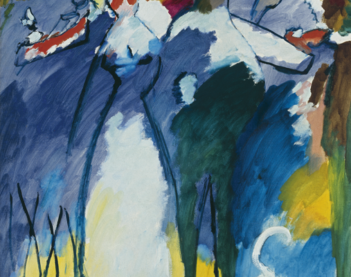
KANDINSKY AND THE SPIRITUAL COLOUR
There are many other fundamental works of art at the GAM. In some of the paintings by Vassily Kandinsky you can feel a beginning and an ending: the end of an analytical and mathematical behaviour towards colour, that comes from the positivist culture of the first half of the 19th century and the studies of colour by Isaac Newton, who divided light in colours. Goethe, in his book Theory of Colours, written in 1810, already tried to give a perceptual, psychological and emotional dignity to colours. In 1799, together with Friedrich Schiller, he wrote Temperamental Roses, where colours were combined with four personalities of people (quick-tempered, even-tempered, hot tempered and melancholy), from which psychological models derive (tyrants, heroes, adventurers; hedonists, lovers, poets; speakers, historians, teachers; philosophers, pedants, rulers). However, if Goethe likes being considered a scientist first of all, Kandinsky feels he is more like a musician and says that in panting he wants to do what Arnold Schoenberg did in music: the friendship between the two men will be a remarkable one, and will have an influence on a whole century. Besides inventing abstraction, and maybe exactly because of this, Kandinsky can maintain a theory of colour focused on the spiritual effect. Every colour has and emits an “interior sound” and has a direction and a movement that puts it, in just one stroke, both on the painting and in our soul.
With Kandinsky, a new colour era starts, with a pure and more aware use of colour that includes William Turner, an abstract artist who was ahead of his time and had been influenced by Goethe, and arrives up to the squares of Josef Albers and to monochrome painting that, as the exhibition’s curators say, takes care of “the pure breath of colour”.
If during the first years of the 20th century the Fauves used colour as an outstanding instrument of their rebellion against art schools, Kandinsky leads the spiritual way which is maybe the most undefined, but for the same reason it is the most prolific as regards splendour. There are many researches carried out by other artists that can be placed on this way, such as the ones by Paul Klee, who taught painting and theory of colour for a decade at the Bauhaus and of whom the exhibition displays the notebooks coming from the Paul Klee Zentrum of Bern. In addition, there are the theosophic researches on colour carried out by Annie Besant, who was forced to paint the lights of other worlds using the “earth’s dull colours”; the esoteric symbolism of M.K. Čiurlionis, a paradigmatic person since he was a sublime composer but he was a deserter of painting in which he finds the concepts to tell that imaginary world evoked in music; last but not least, the works by the followers of Hindu Tantric art, dating back to the 17th century and suggestively in harmony with the fundamental insights of Kandinsky.
NOT ONLY EMOTIONS
The world in which we live is faster and faster and increasingly emotional and superficial. And colourful. The colour is used as an instrument of seduction and wonder: it fosters the purchase. In the packaging, as well as in the new technological products with more and more amazing resolutions, the colour plays a key role in seduction. Maybe also for this imposing and gradual “emotionalization” of the world, the second half of the 20th century and the current artistic experiences seem to abandon the colour as emotional instrument to focus on other kinds of approach. The conceptualism of Laurence Wiener and Robert Barry, author of the majestic work of art One Billion Colored Dots, provides good examples, while the pantone canvas by Damien Hirst reflects on the powerful analytic and synthetic effort of our culture, focused on decoding that eternal continuum offered by reality, that magma where our brain has learnt to sail dividing everything into micro-perceptions able to give us the meaning of things. The interruption of the flow is based on the control we have on it and on the possibility of a common language that we can build, since the pantone canvas is the numbered decoding of the different possible colours, and each of them is fractionated into its building blocks and in this way it is able to be repeated anywhere in the world. However, this only applies to artificial colours while art history is based on colours derived from insects, flowers, plants and any kind of minerals.
Also the psychedelic culture of colour, mentioned in the exhibition through the work of Jim Lambie and some movies and photographs (that are a small part in relation to painting), seems to declare the end of an era and the possibility of giving colour new roles. For example the political role, highlighted by the works of David Hammons, a flag that represents the colours of Africa, or the ones of Asli Cavusoglu who, in her works, uses the “Red Ottoman” which is obtained from an Armenian recipe that replaces the red of the Turkish flag. In the art of the second half of the 20th century, also the exclusiveness of painting decreases and the colour appears on clothes (like the ones worn by Franz E. Walther, who received a Golden Lion at the Venice Arts Festival), on plastics (like the overflowing ones of Tony Cragg and the ironic ones of Pino Pascali) or on lights (Olafur Eliasson).
We can say that art history is a story of palettes, every artist has had their own and with it they opened us up a world, their world, that could only have those colours. Whether it is the pale body of Jesus in the Lamentation of Christ by Mantegna or the dawn’s light of The Immaculate Conception by Tiepolo, each artist’s brush stroke has always been and will always be a choice of colour and therefore a declaration of intent as regards every aspect of reality: emotions included.